|
This SOP outlines the process of creation of Website Media Posts (also referred to as Media Articles) in WordPress and publishing them on the main AdvaCare website.
This SOP contains:
- A description of each section available in WordPress;
- Basic HTML guidelines needed for article creation;
- Detailed process of how to create and publish Media Article pages on the website.
The process is to be carried out by Content Editor, whose role can be assumed by either IT Operations Supervisor or by one of the members of Marketing Dept.
Prior to creating the new Post on the website, Content Editor must receive a task message from the Marketing Dept. notifying that all the content and assets are prepared and requesting to publish the new Post.
Section Types
Media Article page template contains a number of sections, which have different designs.
Media Article design can be referred to in Figma:
https://www.figma.com/design/pXRDVWaRuRqRyncmbs2IC9/AC-Webpages-Design-V4?node-id=1227-2747&t=30MxE6thvY4zNSOO-0
There are several templates in Figma that represent different section types, however, this separation is artificial and is used only for design convenience. In WordPress there is only one Media Article Template, which can contain any combination of any section types.
Design Template 1: Simple content with images
https://www.figma.com/design/pXRDVWaRuRqRyncmbs2IC9/AC-Webpages-Design-V4?node-id=5376-15330&t=30MxE6thvY4zNSOO-1
Design Template 2: Interactive content, contains dynamic content sections
https://www.figma.com/design/pXRDVWaRuRqRyncmbs2IC9/AC-Webpages-Design-V4?node-id=16896-111959&t=30MxE6thvY4zNSOO-1
Design Template 3: Product focused content, contains product-related sections
https://www.figma.com/design/pXRDVWaRuRqRyncmbs2IC9/AC-Webpages-Design-V4?node-id=16896-112231&t=30MxE6thvY4zNSOO-1
Content must be prepared by Marketing Dept. based on the section designs.
Overall there are 11 sections available in WordPress:
- Single
- Accordion
- VerticalScroll
- Tabs
- Product
- CallToAction
- Gallery
- Benefits
- Testimonials
- ProductsGrid
- Products Horizontal Grid
- Products Vertical Grid
- Carousel Slider
- Products Small Grid
- ProductsCollection
Detailed description of each section is given below.
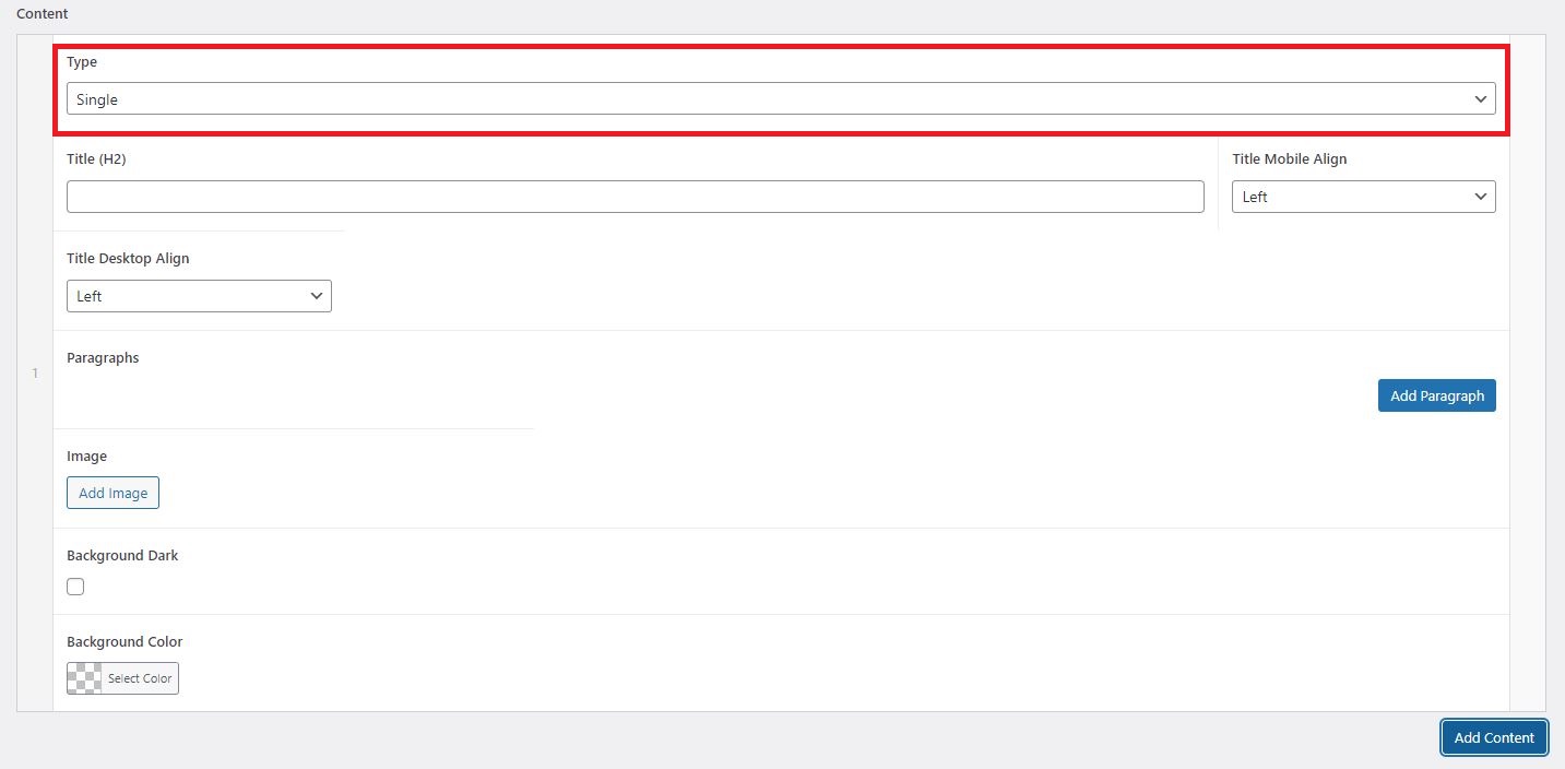
Single
Single content type is the most basic section type that is used for:
- Paragraph of text without any images
- Paragraph of text with one image on the side (right or left side)
- Paragraph of text with one image above or below the text
- Paragraph of text with a blockquote

Single paragraph can contain h2, h3, bullet points, numbered lists, links. Single section is the most frequently used section in all the articles.
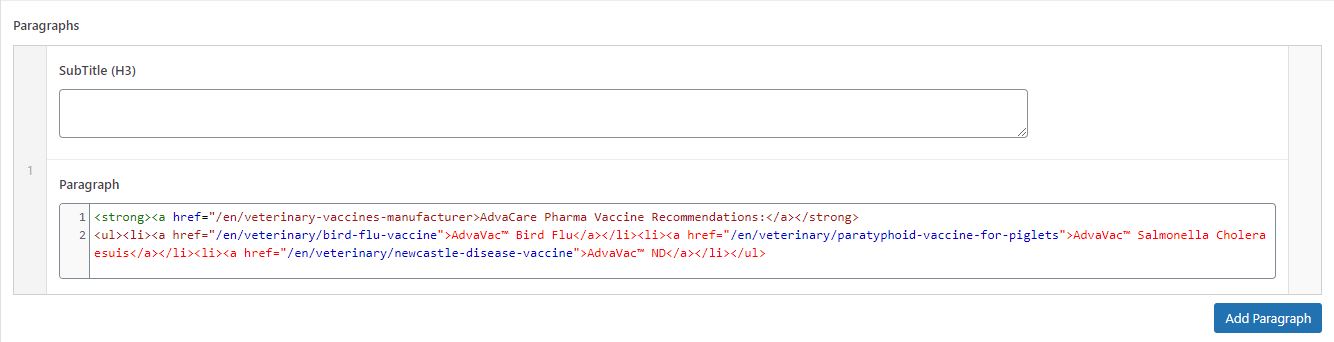
In WordPress the section looks like this:
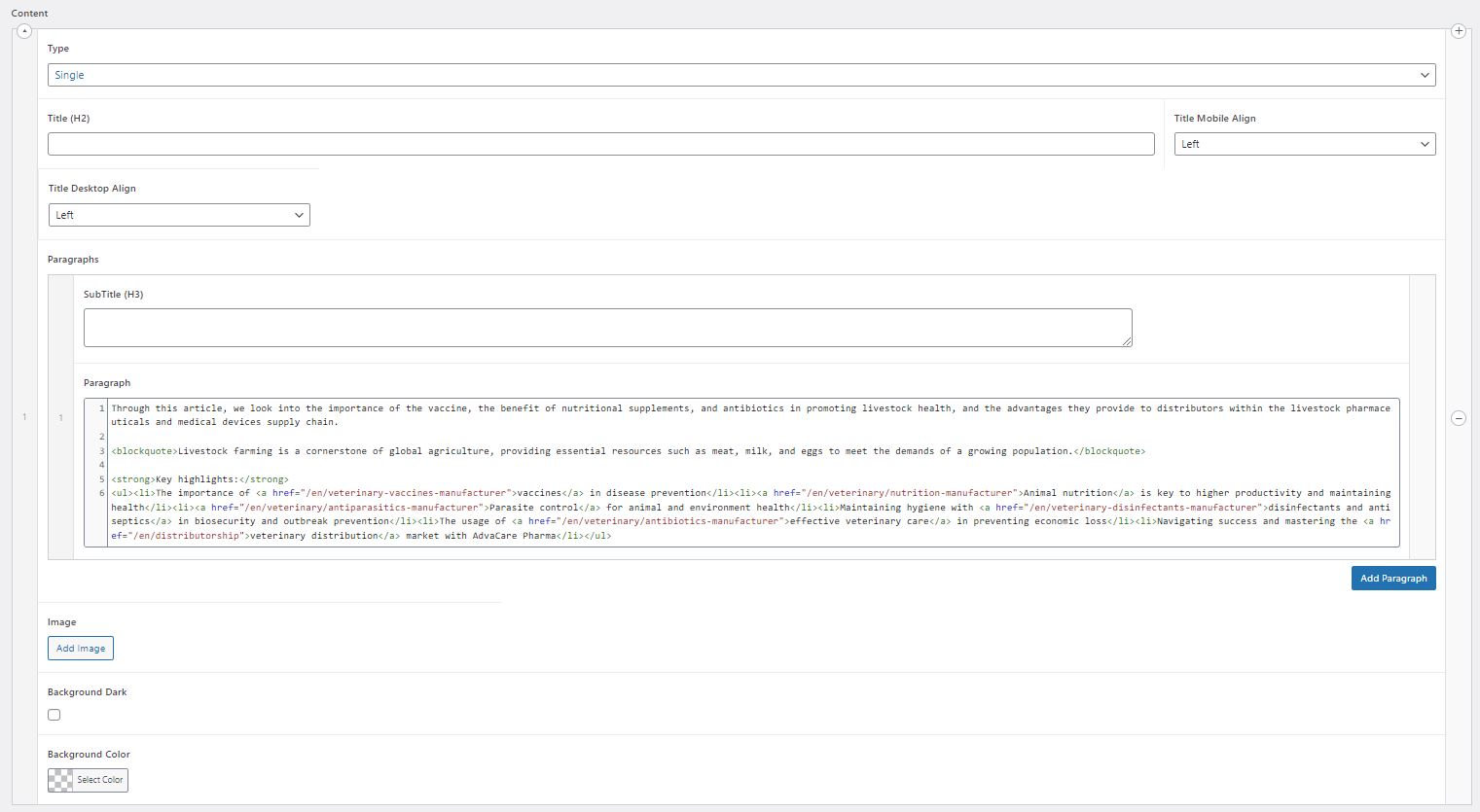
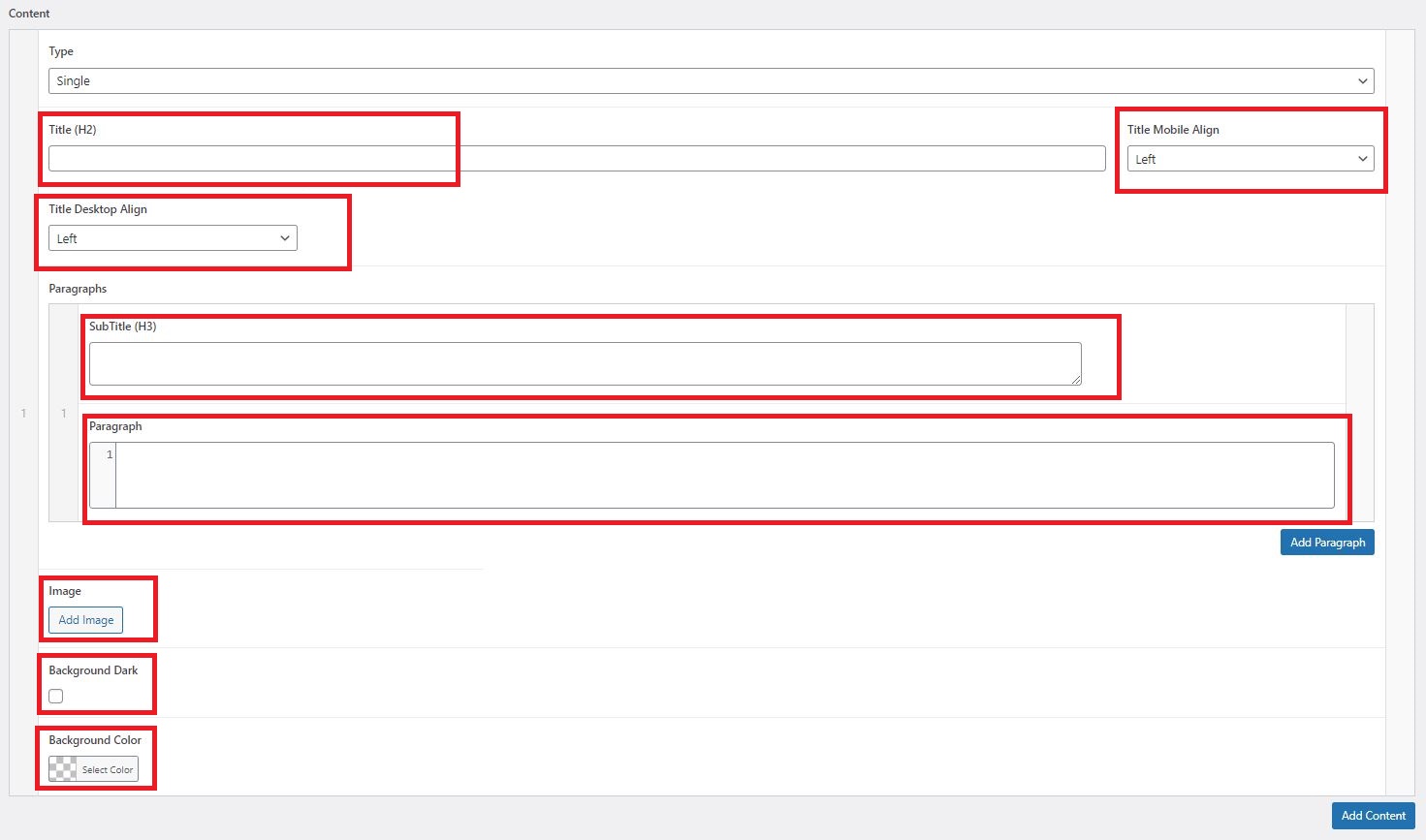
The following fields are available for editing:
- Title (
h2): represents the h2 headline. Can be filled out when there is a headline for the paragraph.
- Title Mobile Align: the setting to control the
h2 align in Mobile. There are 2 options of Mobile Align available: "Left" and "Center". Content Editor can decide which align is applicable for the article, or keep the default setting "Left".
- Title Desktop Align: the setting to control the
h2 align in Desktop. There are 3 options of Desktop Align available: "Left", "LeftMaxWidth" and "Center". "LeftMaxWidth" option breaks the text in the middle of the screen, to make the page design more dynamic. Content Editor can decide which align is applicable for the article, or keep the default setting "Left".
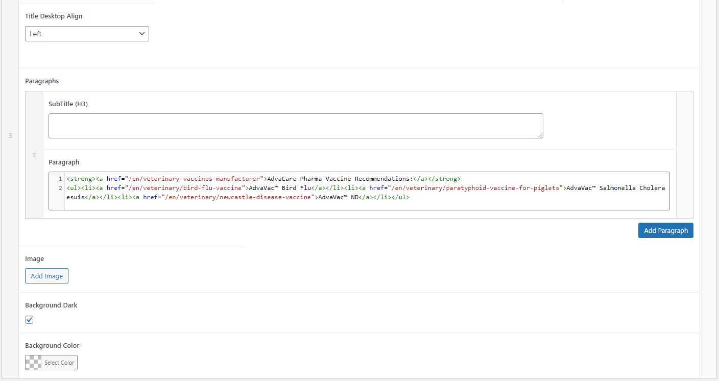
- SubTitle (
h3): represents the h3 headline. Can be filled out when there is a headline for the paragraph.
- Paragraph: field where text of the article to be added. The text can contain html tags for any elements that need to be used, such as boldness (
<strong></strong>) or italic (<em><em>), quotes (<blockquote></blockquote>), unordered lists (<ul><li>), links (<a></a>).
- Image: a field to add an image if image is required. Once an image is added, two additional fields will become visible, and are mandatory to fill out, "Image Align" dropdown with "Above", "Left", "Right", "Below" - these options define the position of the image on the page. "Image Float" checkbox needs to be used for "Right" and "Left" options to let the text wrap the image.
- Background Dark: checkbox to set the background of the section to blue. This option will set the background to the standard blue background color, the same that is used in many places across the website.
- Background Color: the field that allows to set custom color as section background. The color code needs to be set in hex format.
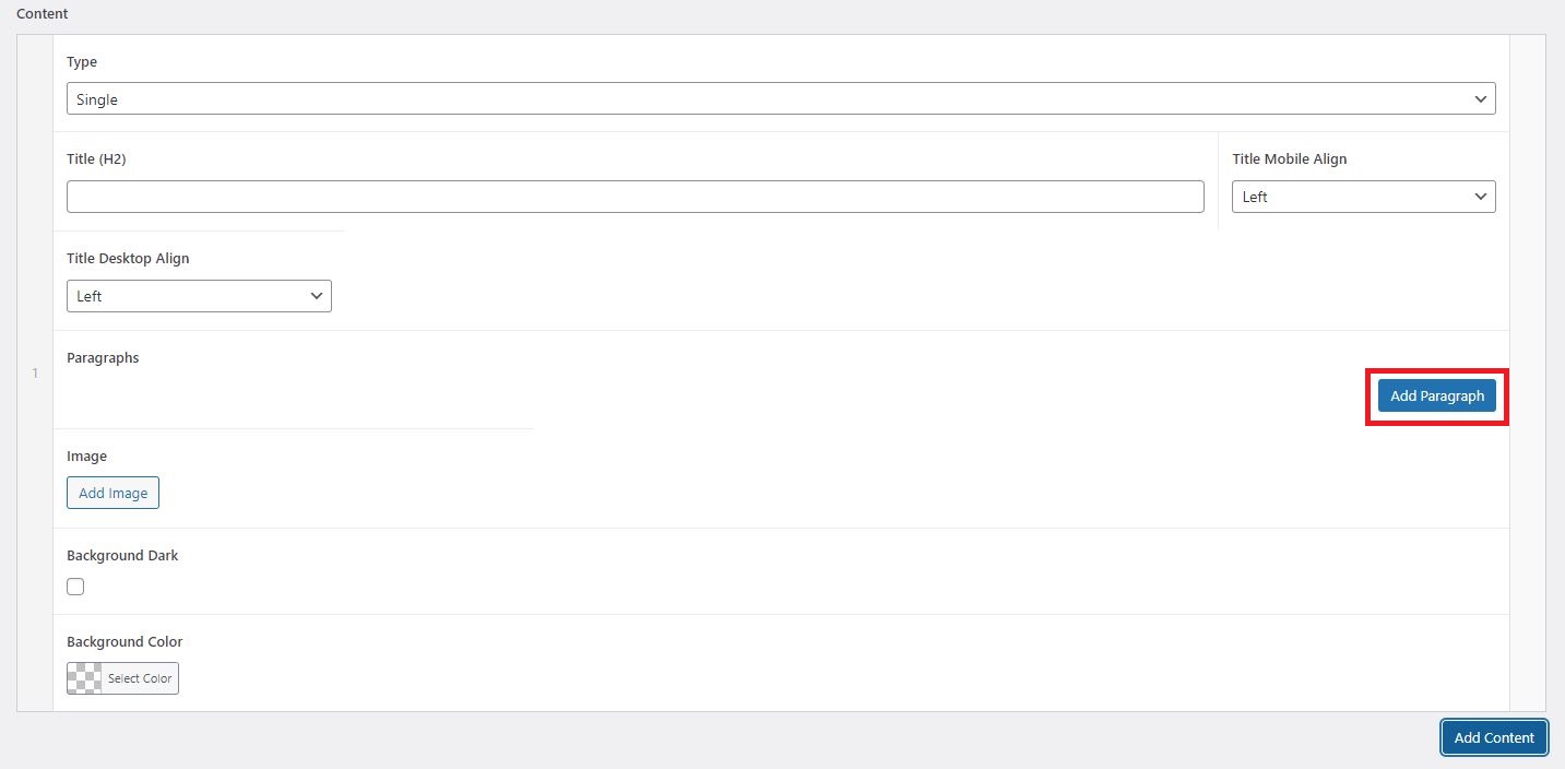
"Add Paragraph" button allows to add as many paragraphs of text as necessary.
Accordion
Accordion is the content type that is used to make content displayed in 5 unfoldable sub-sections, where each can have its own image that switches on the left depending on which sub-section is unfolded, or one general image that applies to all sub-sections.

Accordion contains Title (h2) and 5 Paragraphs, where each Paragraph represents 5 sub-sections. Each sub-section contains SubTitle (h3), Paragraph, and Image. If each sub-section does not require to have its own image, then leave "Image" field blank, and fill out the main image in the very bottom of the Accordion section.
VerticalScroll section is designed to be a vertical slider for products or other pages of the website. The section has h2 Title, a short paragraph of text, vertical slider with products and basic product information (or other pages) with a link to those products (or pages), and an image on the right that is static.
VerticalScroll contains Title (h2), Intro, and several Paragraphs with information about each product/page in the slider, and one general image in the bottom of the section. Each paragraph contains the following fields:
- SubTitle (H3): the name of the product/page displayed in the slider;
- Link: the product/page link of each slide;
- Subtitle Right: the text on the right side from the product name/page name inside the slider, in case of products it is used to add dosage or some product specification. This field can be left blank if it’s not required to display this information.
- Paragraph: each product/page information, which is located under the product/page name.
- Image: the small image on the left from the product/page name.
Tabs
Tabs is the section that contains a table with content inside switchable tabs on the left, and switchable images on the right. This section has h2 Title and as many sub-sections and images as needed.
Tabs section contains Title (h2), and several Paragraphs with the Subtitles, text and images for each tab.
Product
Product section consists of 2 design options:
- Design with one single product information
- Design with a product slider which allows to add many products
The Single Product section contains the information about one product, which is pulled from the relevant L4 page. In WordPress only 2 fields need to be filled out to be able to use this design:
- Type (Product)
- Product (name of the product that needs to be displayed)
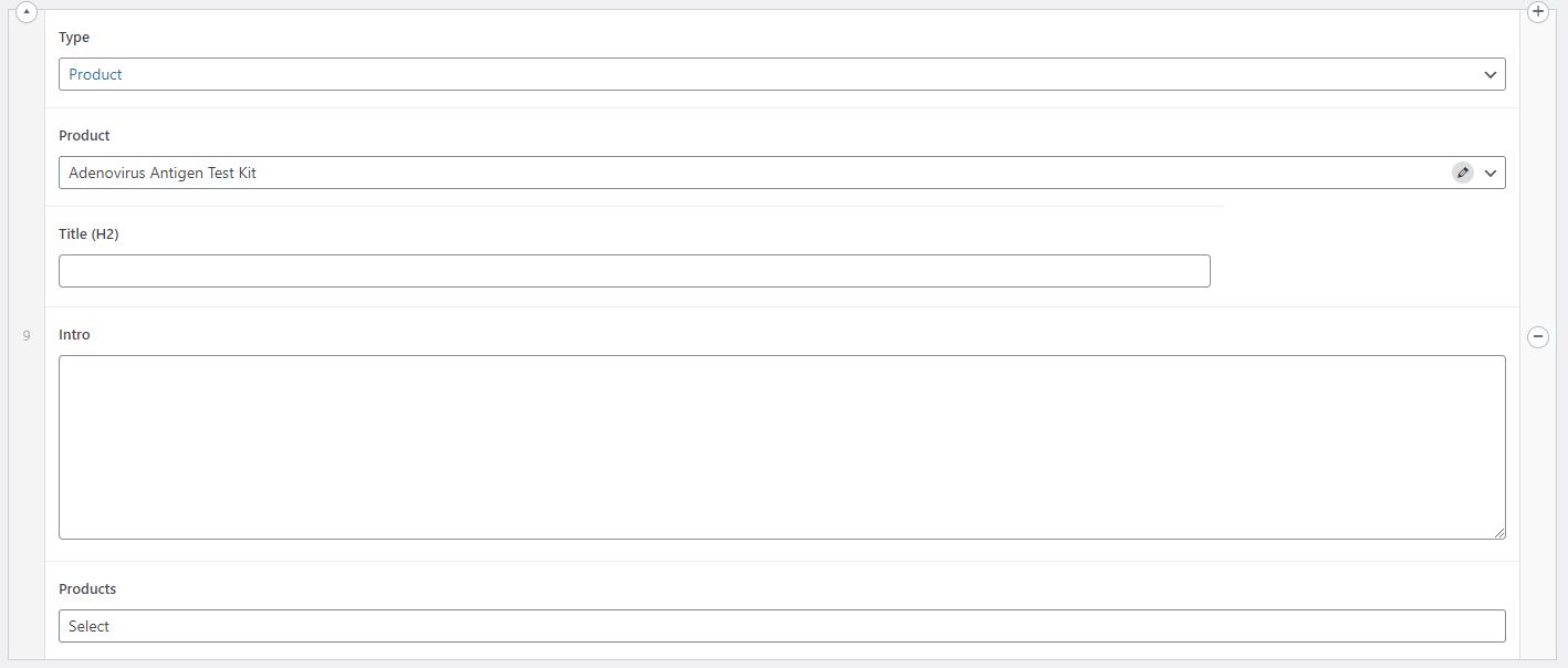
All the product information displayed in the section (product name, brand name, product description, product specifications, product images, CTA buttons) will be automatically pulled from the selected L4 page.
All the other fields in this section belong to multi-product slider design.
Multi-Product Slider contains a Title (h2), a short introduction or description, and a slider with multiple products. In WordPress the following fields need to be filled out accordingly:
- Title (
h2) (headline of the section)
- Intro (short description)
- Products (products that will be displayed in the slider)
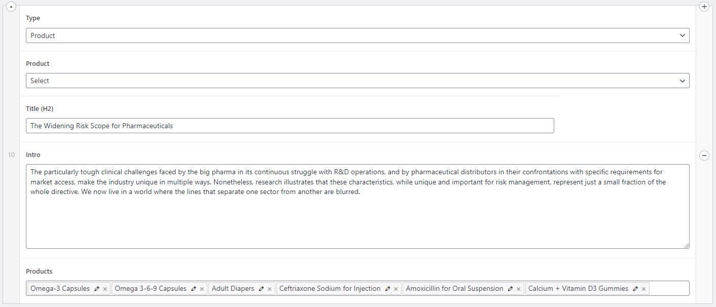
All the product information displayed in the slider (product names, brand names, product images) will be automatically pulled from the L4 pages selected in the "Products" field.
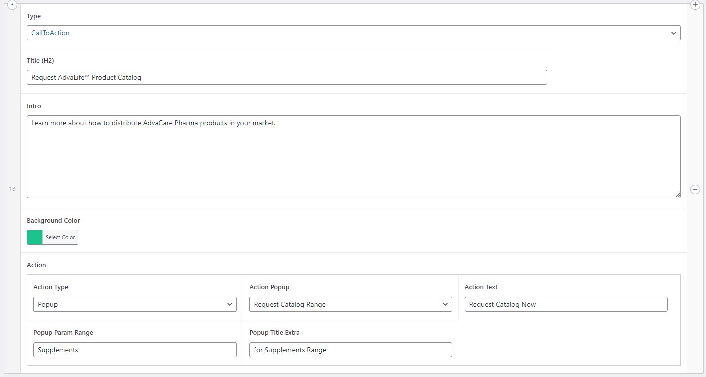
CallToAction
CallToAction is the section that allows to add any CTA button with short text in any place inside an Article.
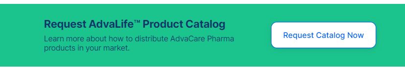
CallToAction section has the following fields to be filled out in WordPress:
- Title (
h2) - the main text of a CTA
- Intro - the supporting text under the headline (if required)
- Background Color - can be set to any color by setting a hex color code
- Action Type - indicates which action is triggered by pressing the CTA button, the action type can either be a Link (means when user clicks the CTA button it takes him to another page), or Popup (means when user clicks the CTA button a popup is opened to fill out a form)
- Action Link/Action Popup - depending on Action Type selected in the previous field, this field allows to either choose a specific page which CTA will be linked to (in case of Link Action Type), or to choose a specific popup that needs to be triggered by the button (in case of Popup Action Type). There is a limited number of popups available, only the popups that already exist on the website can be selected here.
- Action Text - the text displayed inside of the CTA button
- Popup Param Range - option available only for Popup Action Type. Should be used in a very specific case of when "Request Catalog Range" is selected, and indicates which product range should be pre-selected in the form. For example, if CTA is to request catalog for AdvaLife range, then it is better to have Supplements checkbox preselected in the form. In this case, "Supplements" should be filled in the "Popup Param Range" field. If a pre-selected checkbox is not required, leave this field blank.
Note: The range name must match with the name of the range of the relevant L3 page, otherwise the pre-select of the checkbox will not work. Each language will have a different name of the range according to the translation.
- Popup Title Extra - option available only for Popup Action Type. Should be used in a very specific case of when "Request Catalog Range" is selected, and indicates the additional text in the name of the popup in addition to standard "Request a Catalog". For example, if CTA is to request catalog for AdvaLife range, then it is better to have the popup name "Request a Catalog for Supplements Range". In this case, "for Supplements Range" needs to be filled in the "Popup Title Extra" field. If it is not required to add anything to the popup title, leave this field blank.
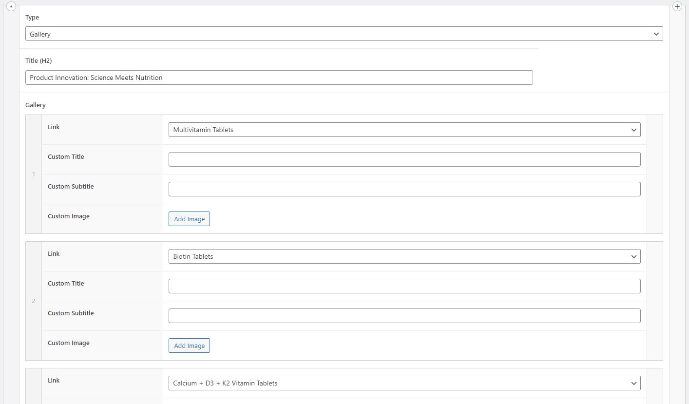
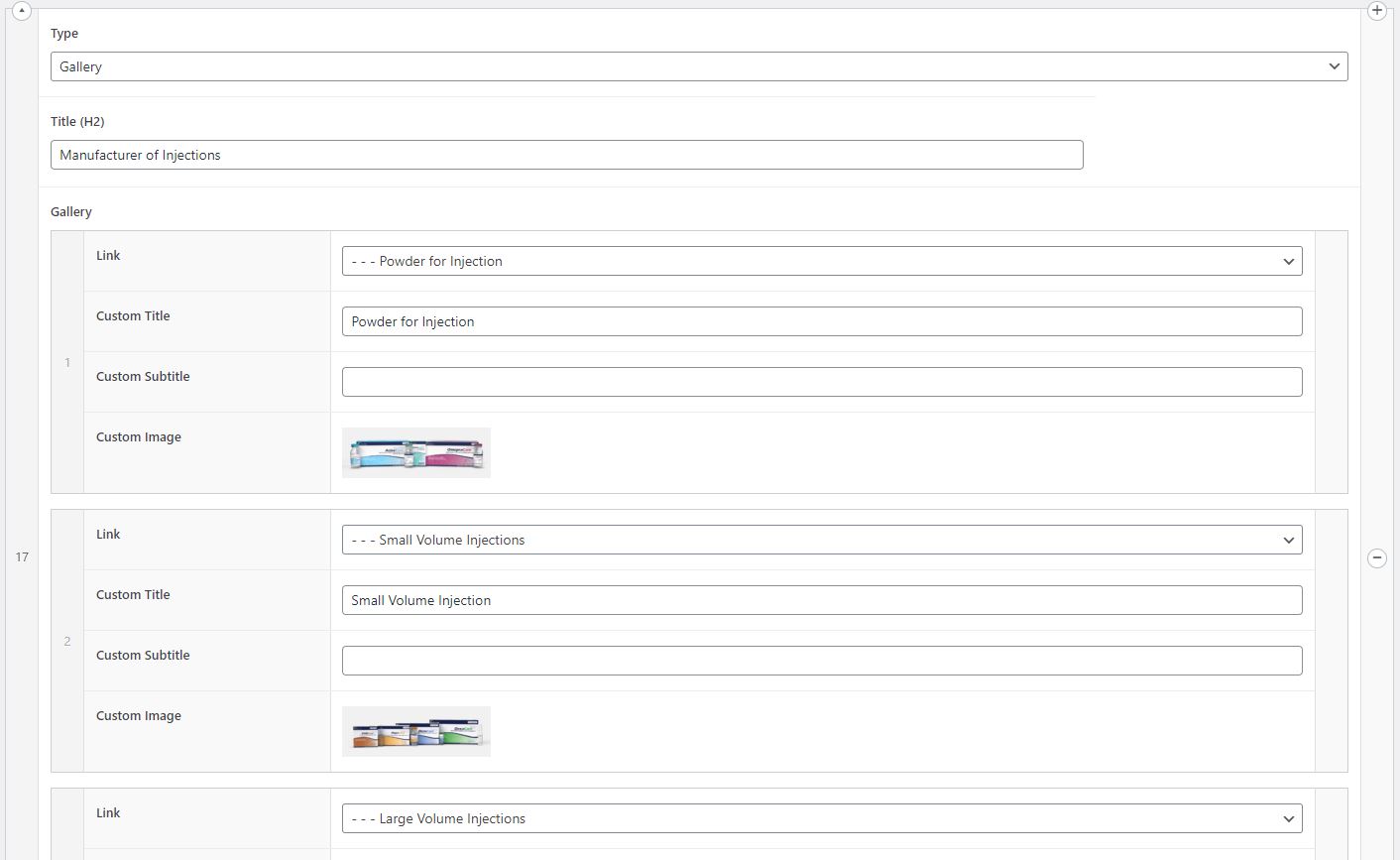
Gallery
Gallery section is a grid of products or pages with 3 elements in a row. It can contain any number of product pages or any number of any other pages of the website.
Gallery with pages:
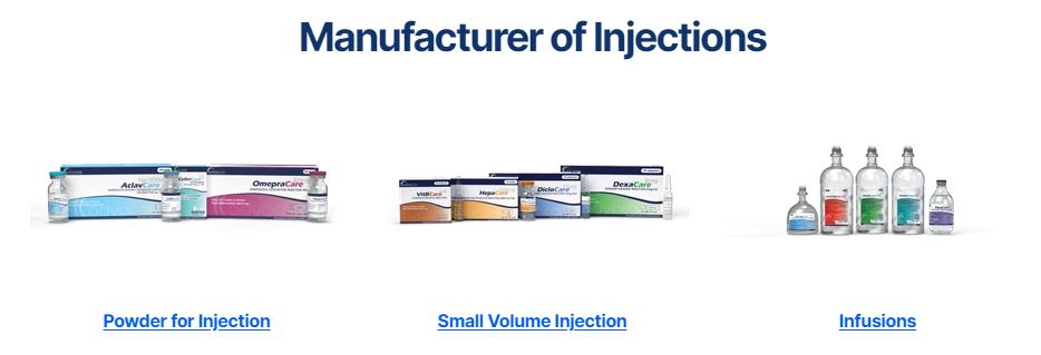
Gallery with products:
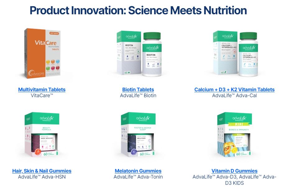
In WordPress the following fields need to be filled out:
- Title (
h2)
- Link - choose the page that needs to be displayed in the grid. Any website page can be selected, but if a Product page is selected then the rest of the fields in "Gallery" sub-section in WordPress don't need to be filled out.
- Custom Title - if the title of the page should not be the same as the actual page title, then fill out this field with any name that should be displayed in the grid.
- Custom Subtitle - this field is to be filled if any custom subtitle is required under the title. For product pages by default the brand name will be displayed, no need to fill out this field unless it is required to display some other information instead of the brand name.
- Custom Image - this field is to be filled for pages, to display the image in the grid. For product pages no image needs to be added here, by default the first image from the product page will be displayed. If pages are added instead of products, then it is mandatory to set an image for each one.
Add as many rows as there are items in the grid.
WordPress for Gallery with products:
WordPress for gallery with pages:
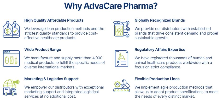
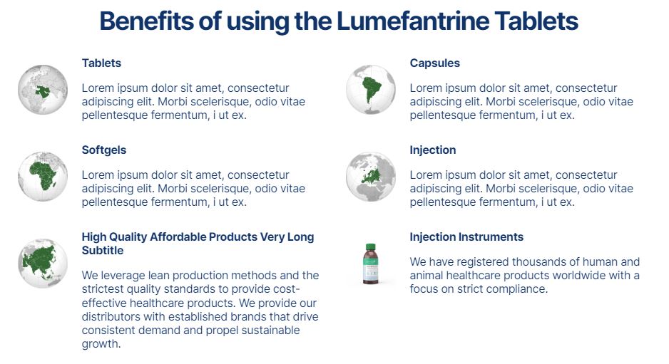
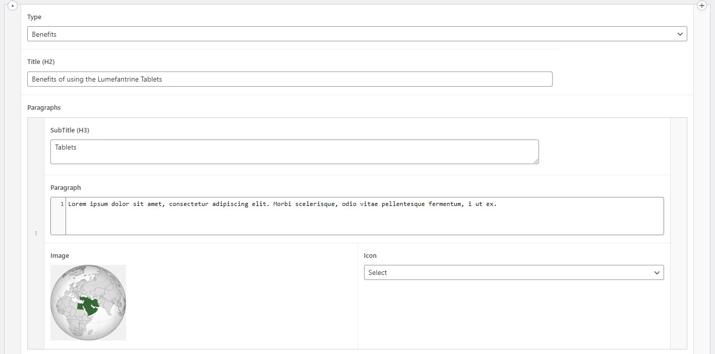
Benefits
Benefits section is a section that displays a grid of USPs with either icons or images, selling points and short descriptions of each selling point.
Benefits section with icons:
Benefits with images:
The following fields need to be filled out in WordPress:
- Title (
h2)
- SubTitle (
h3) - the name of each selling point
- Paragraph - the short description under each selling point name
- Image - to be filled out only when an image is used (in jpg, jpeg, png, etc. formats)
- Icon - to be used only for SVG icons. The number of available icons is limited to those that are already uploaded on the website. New SVG icons cannot be uploaded by a Content Editor, therefore if none of the existing SVG icons can be used for a given article, it is best to use an image format instead of SVG. Marketing Designer can prepare any icon in an image format.
Add as many paragraphs as required.
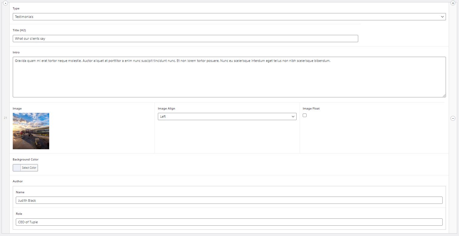
Testimonials
Testimonials section displays the testimonials from customers as a quote with an image.
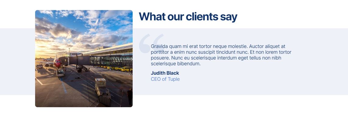
The following fields are to be filled out in WordPress:
- Title (
h2)
- Intro - the text of the quote/testimonial
- Image - the image displayed in the testimonial
- Image Align - the setting to control the placement of the image, the workable options for this section are "Left" and "Right". While "Above" and "Below" options are also available in the dropdown menu, these two options should not be used for this section.
- Image Float - this option is not to be used in this section
- Background Color - set the hex color code of the background of the quote/testimonial
- Author Name - the name of the author displayed under the quote/testimonial
- Role - the role or job position of the author of the quote/testimonial
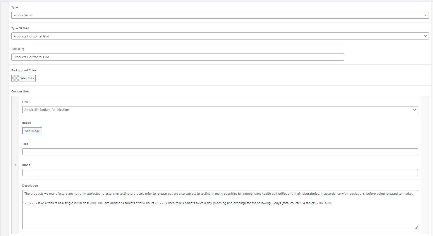
ProductsGrid
ProductsGrid is the most extensive section of Article pages and consists of several sub-types. ProductsGrid is the section that displays products or pages in several different designs, but is mostly intended to be used for products.
1. Products Horizontal Grid
Horizontal Grid is designed to display the products in a grid of 2 products/row. It displays product image, product name, product brand name, product description and 2 CTA buttons (Add to Inquiry List and View Product).
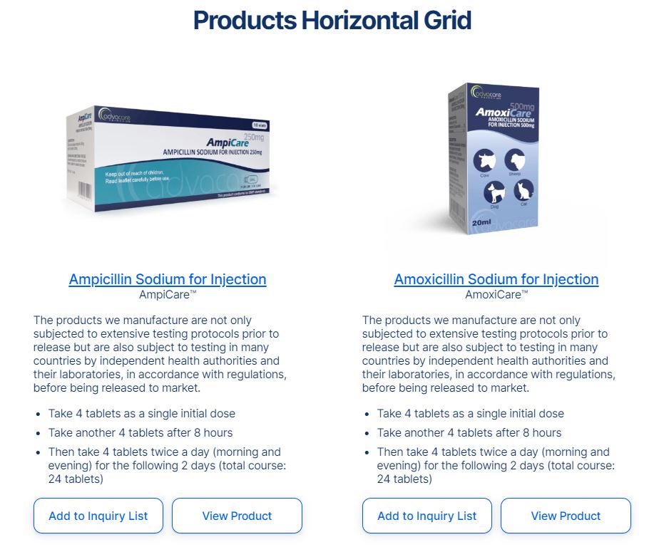
The following fields are to be filled out in WordPress:
- Title (
h2)
- Background Color - if it is required to select a background color for this section, set the hex color code in this field.
- Link - select the product page of the desired product
- Image - set the image if the image needs to be different from the default image. If not filled out, the first image from the product page will be displayed by default.
- Title - set the title if the title needs to be different from the default title. If not filled out, the product name from the relevant L4 page will be displayed by default.
- Brand - set the brand if the brand needs to be different from the default brand. If not filled out, the brand name from the relevant L4 product page will be displayed by default.
- Description - fill out the description that needs to be displayed under the brand name. If left blank there will be no text under the brand name. If bullet points are required to be displayed in this section, then html structure
<ul><li> for unordered list must be used.
Add as many products as required. The buttons "Add to Inquiry List" and "View Product" are added to all products by default and cannot be changed.
2. Products Vertical Grid
Vertical Grid is designed to display products or pages in a vertical grid with one item per row. Depending on the fields filled out in WordPress, this section can be used for products and for any other pages.
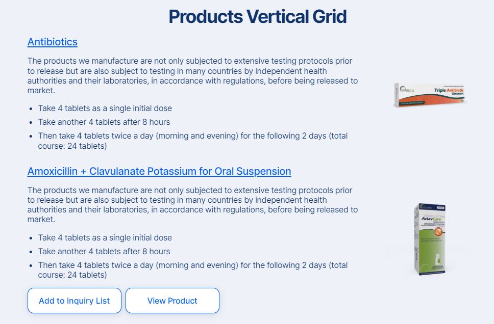
The following fields are to be filled out in WordPress:
- Title (
h2)
- Background Color - if it is required to select a background color for this section, set the hex color code in this field.
- Link - select the product page of the desired product, or any other page of the website
- Image - set the image if a page is selected. When a product is selected, the first product image from the product page will be displayed by default, there is no need to fill out this field.
- Title - fill out this field if the displayed title needs to be different from the title of the page that was selected. When a product is selected, the product name will be displayed by default, no need to fill out this field.
- Brand - this field is not active in this section, no need to fill out.
- Description - fill out the description that needs to be displayed under the page name or product name. If bullet points are required to be displayed in this section, then html structure
<ul><li> for unordered list must be used.
The buttons "Add to Inquiry List" and "View Product" will be added inside the grid automatically when product pages are selected. These buttons cannot be changed.
3. Carousel Slider
Carousel Slider is the most dynamic and useful section of all Products Grid sections. This section displays the information about a product, page or item in the form of a slider with images and text description below.
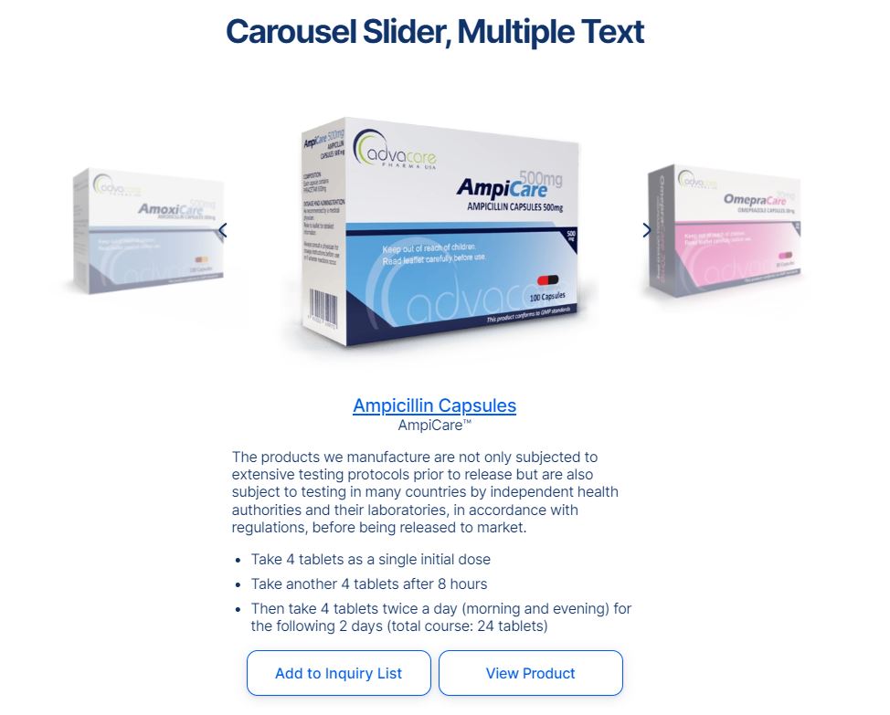
This section can be used in 3 main ways:
- To display 3 different products/pages with custom product/page information for all 3 products/pages (Multiple Text option)
- To display one product/page information with several images (Single Test option)
- To display information with several images that is not connected to any particular page/product (Items option)
Depending on the purpose, the fields in WordPress need to be filled out in different ways.
Multiple Text option
To use this section to display 3 products/pages with custom product/page information fill out the following fields in WordPress:
- Title (
h2)
- Background Color - set the hex color code if need to add background color for the section
- Link - select the product/page that needs to be linked to this section
- Image - add an image if a page is selected. Leave the field blank if product is selected (by default the first image from the product page will be displayed)
- Title - fill out the title displayed under the image. This field is mandatory to be filled regardless whether a page or a product is selected. If this field is not filled out nothing will be displayed under the image.
- Brand - fill out this field if brand name is required to be displayed. When a product is selected, this field will NOT be auto-filled. This field can be left blank if it is not required to add any text below the title
- Description - fill out the product/page information to be displayed under the brand name. If bullet points are required to be displayed in this section, then html structure
<ul><li> for unordered list must be used.
- Actions - add an Action if any custom buttons need to be added under the Description. When a product is selected, 2 buttons "Add to Inquiry List" and "View Product" will be added automatically, so no need to add an Action.
Action should only be added when pages are selected in this section. Once Action is added, fill out the fields Action Type, Action Popup, Action Text, Popup Param Range, Popup Title Extra, same way as described for CallToAction section.
Note: the product/page filled out in the second "Row" in WordPress will be displayed in the middle of the slider, or, in other words, the second product/page will be displayed when the user lands on the Article page.
Single Text option
To use this section to display one product/page information with several images fill out the following fields in WordPress:
- Title (
h2)
- Background Color - set the hex color code if need to add background color for the section
- Link - select the product/page that needs to be linked to this section, BUT ONLY IN THE SECOND ROW. Leave Link field blank in the first row.
- Image - add images in every Row. This field is mandatory to be filled out for this section sub-type. The image added in the second row will be displayed when the user lands on this page.
- Title - leave this field blank for every row except the second row. This field is mandatory to be filled out for the second row.
- Brand - fill out this field if brand name is required to be displayed. If brand name is required then fill it only in the second row.
- Description - fill out product/page information only in the second row. If bullet points are required to be displayed in this section, then html structure
<ul><li> for unordered list must be used.
- Actions - add an Action in the second row if any custom buttons need to be added under the Description. When a product is selected, 2 buttons "Add to Inquiry List" and "View Product" will be added automatically, so no need to add an Action.
Action should only be added when pages are selected in this section. Once Action is added, fill out the fields Action Type, Action Popup, Action Text, Popup Param Range, Popup Title Extra.
Note: only the product/page filled out in the second "Row" in WordPress will be displayed. The rest of the rows are used to add images into the slider. When switching the slider, the product/page information will not switch, as there is only one product/page information in this sub-type.
Items option
To use this section to display information with several images that is not connected to any particular page/product fill out the following fields in WordPress:
- Title (
h2)
- Background Color
- Link - leave this field blank, as no page/product need to be connected in this sub-type
- Image - fill out the image field in every row
- Title - fill out the title that needs to be displayed under the images. This field can be filled out only in the first row if only one text is required, or in every row if this section is meant to contain text under each image
- Brand - leave this field blank if no brand is required. This text is to be displayed under the Title. Depending on how many titles are filled out, fill out Brand accordingly if required
- Description - fill out the information that needs to be displayed under the title and brand. This field can be filled out only in the first row if only one text is required, or in every row if this section is meant to contain text under each image. If bullet points are required to be displayed in this section, then html structure
<ul><li> for unordered list must be used.
- Actions - add an Action in the first row or in every row depending on how many texts are added, if any custom buttons need to be added under the Description.
Action should only be added when pages are selected in this section. Once Action is added, fill out the fields Action Type, Action Popup, Action Text, Popup Param Range, Popup Title Extra.
4. Products Small Grid
Small Grid section is designed to display the products in a grid of 3 products/row. It displays product image, product name, product brand name, product description and 2 CTA buttons (Add to Inquiry List and View Product).
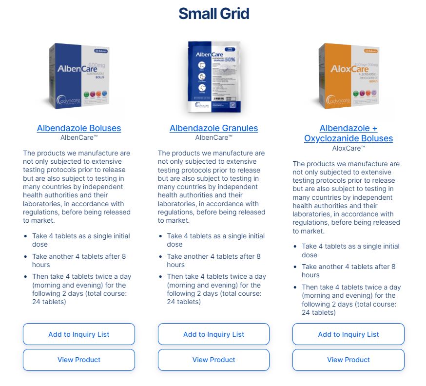
The following fields are to be filled out in WordPress:
- Title (
h2)
- Background Color - if it is required to select a background color for this section, set the hex color code in this field.
- Link - select the product that needs to be displayed in this section
- Image - it is not required to fill out this field, the first image from the product page will be displayed by default if this field is left blank
- Title - it is not required to fill out this field, the product name will be displayed by default
- Brand - it is not required to fill out this field, the product brand name will be displayed by default
- Description - fill out the description that needs to be displayed under the brand name. If left blank there will be no text under the brand name. If bullet points are required to be displayed in this section, then html structure
<ul><li> for unordered list must be used.
Add as many products as required. The buttons "Add to Inquiry List" and "View Product" are added to all products by default and cannot be changed.
ProductsCollection
ProductsCollection is the section that displays "You might be interested in..." slider with 4-8 products.
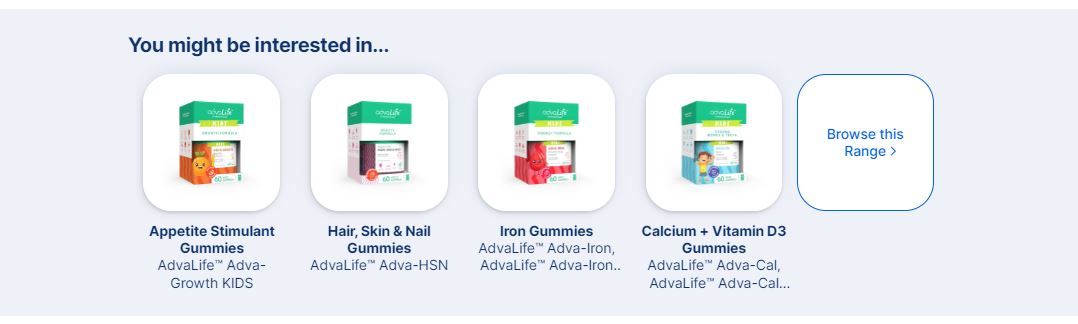
The following fields are to be filled out in WordPress:
- Title (
h2) - fill out "You might be interested in…" or a similar title as required
- Products - add the products that need to be displayed in the slider. Add either 4 or 8 products. Do not add any number of products not divisible by 4.
- Background Color - set the hex color code for the background.
- Action - set Action Type, Action Link and Action Text to display the "Browse this Range" button. Action Type needs to be set to Link, Action Link needs to be set to the page that will open on click, Action Text needs to be set to "Browse this Range" text.

Basic HTML tags are used in WordPress to add certain functions or design elements to the content.
Each HTML uses brackets to wrap certain commands to the browser, there is always an opening tag <...> and a closing tag </...>. Opening tag is placed before the text that needs to be changed, and the closing tag is placed after the text that needs to be changed. HTML tags must always be EXACTLY as per format, otherwise they will not work.
There should never ever be any extra spaces or symbols inside the tag.
-
Bold
The HTML tag to make the text bold is <strong></strong>, where <strong> is the opening tag which should be placed before the text that needs to be bold, and </strong> is the closing tag which should be placed after the text that needs to be bold.
For example, to make the text "Test" bold on the page, the following structure is to be used:
<strong>Test</strong>
There should never be any extra spaces or symbols inside the brackets.
-
Italic
The HTML tag to make the text italic is <em></em>, where <em> is the opening tag to be placed before the text, and </em> is the closing tag to be placed after the text that needs to be italic.
For example, to make the text "Test" italic on the page, the following structure is to be used:
<em>Test</em>
There should never be any extra spaces or symbols inside the brackets.
-
Link
The HTML tag to add a hyperlink to the text is <a></a>, where <a> is the opening tag to be placed before the text, and </a> is the closing tag to be placed after the text that needs to be a link.
However, adding <a></a> structure is not enough to make a hyperlink, as there is no destination. To set the link destination, the attribute href="" is to be added inside <a> opening tag. The destination hyperlink is to be added inside "".
For example, to make the text "Test" a link that goes to Google page, the following structure is to be used:
<a href="https://www.google.com/">Test</a>
To make a link to any page on AdvaCare website, it is required to remove the domain from the link. The domain of the hyperlink is the part https://www.domain.com of the hyperlink. For example, the full hyperlink to Media page of AdvaCare website would be:
https://www.advacarepharma.com/en/news
To add this hyperlink on the page the following structure should be used without the domain:
<a href="/en/news">Test</a>
NOTE: every internal link MUST ALWAYS start with “/”. The links without “/” will not work correctly, as without “/” the URL will be relative, prepending the current URL.
There should never be any extra spaces or symbols inside the brackets.
-
Unordered List
Unordered List is the list of bullet points in the text. To add bullet points to the text the following structure is used:
<ul><li>Bullet Point Text 1</li><li>Bullet Point Text 2</li><li>Bullet Point Text 3</li><li>...</li></ul>
<ul> tag represents Unordered List (hence abbreviation "ul"), and <li> tag represents each list item (hence abbreviation "li", from "list item").
All the tags as per example above must be placed into the same line, without any spaces between the tags or "enter" breaks.
There should never be any extra spaces or symbols inside the brackets.
-
Ordered List
Ordered List is the list of numbered points in the text. To add numbered list of points to the text the following structure is used:
<ol><li>Text of Point 1</li><li>Text of Point 2</li><li>Text of Point 3</li><li>...</li></ol>
<ol> tag represents Ordered List (hence abbreviation "ol"), and <li> tag represents each list item (hence abbreviation "li", from "list item").
All the tags as per example above must be placed into the same line, without any spaces between the tags or "enter" breaks.
There should never be any extra spaces or symbols inside the brackets.
-
Quote
The HTML tag to add a quote is <blockquote></blockquote>, where <blockquote> is the opening tag to be placed before the quote, and </blockquote> is the closing tag to be placed after the quote. This tag is used to display the text with the quote design on the page:

For example, to make the text "Test" be displayed as a quote on the page, the following structure is to be used:
<blockquote>Test</blockquote>
If the text inside the quote needs to be centered, then the following html structure must be used:
<blockquote style="text-align: center;">Text</blockquote>
There should never be any extra spaces or symbols inside the brackets.
-
Line Break
The HTML tag to add a line break in any text is <br>. This tag only has an opening tag and no closing tag. This tag is used rarely, as usually inside the content blocks in WordPress it is enough to add an "enter" to start the text from a new line. However, in some rare cases an "enter" does not work, then the tag <br> can be used.
There should never be any extra spaces or symbols inside the brackets.
When creating an Article page, Content Editor must be very clear on which tag is used for what and how to add them into the content to achieve the format required. Usually a combination of tags is to be used, depending on the format required.
Note: When a combination of several html tags is used, it is important to keep the subsequent order of tags. The tag opened first should be closed last, in other words, the first tag wraps every other tag inside, e.g. <strong><a>Text</a></strong>, in this order, NOT
<strong><a>Text</strong></a>.
For example:
As can be seen in the screenshot above, WordPress editor helps to add the colors to HTML tags to make it easier to see mistakes. The correctly used HTML tags are marked in green. Attributes inside the tags (such as href=) are marked in blue. Hyperlinks are marked in dark red.
When HTML structure is broken the colors will be changed, and wrong structure will be marked in bright red:
When creating an Article page, Content Editor MUST make sure that no places are marked in bright red.
Note: if Content Editor is unsure which HTML tags to use to achieve the needed goal, ask ChatGPT or IT Operations Supervisor to help.
WordPress Edition
WordPress is an open source Content Management System (CMS), which allows users to edit the existing content on the website and publish new pages on the website.
The website has 2 main environments in which Content Editors will need to work in:
- PRODUCTION: the live website which is visible to all external users and is searchable in Google search results
- DEV: the development environment, visible only to AdvaCare employees and protected by the password. This environment is used for testing purposes, for example to preview any new Article before it is published in the live website.
Accessing WordPress
To access WordPress open one of the following URLs.
DEV:
https://admin.dev.4.advacarepharma.org/wp-admin/
PRODUCTION:
https://admin.advacarepharma.org/wp-admin/
Every Content Editor has their own dedicated WordPress account to be able to login and make changes in the website.
Any Article must be first published in DEV environment, QA’ed and revised, and only once it is 100% final can it be published in PRODUCTION environment.
In DEV environment there is a shortcut to open WordPress editor for any website page that is opened in the current browser tab:
Ctrl + Shift + E
.
Creating a new Article Page in WordPress
Articles in WordPress are referred to as Posts.
There are two ways to create a new Article page:
- Navigate to "Posts" inside the left menu side panel and click "Add New Post" button on top of the screen.
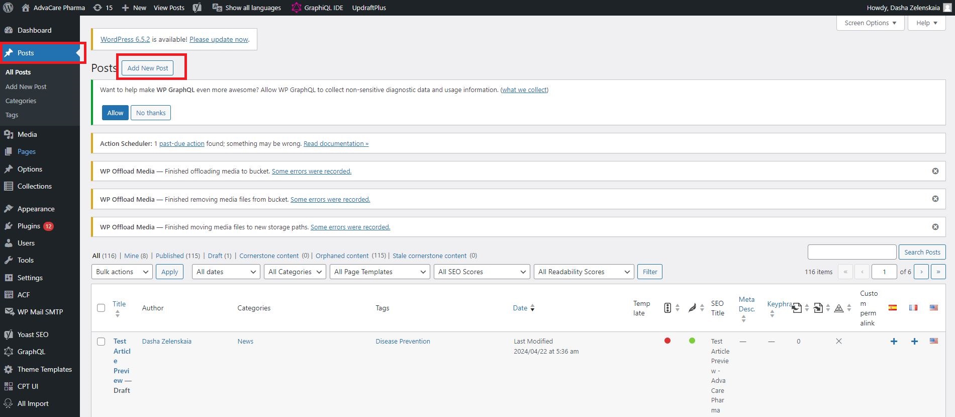
- Open any existing Article page in WordPress and click "Add New Post" on top of the screen.
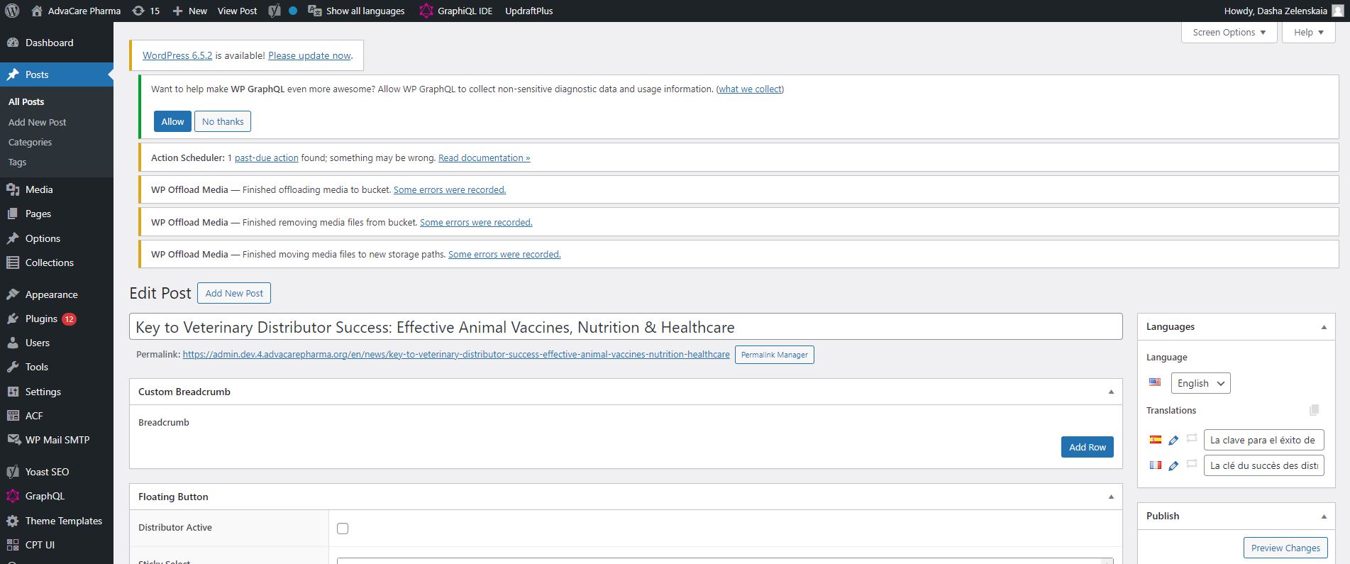
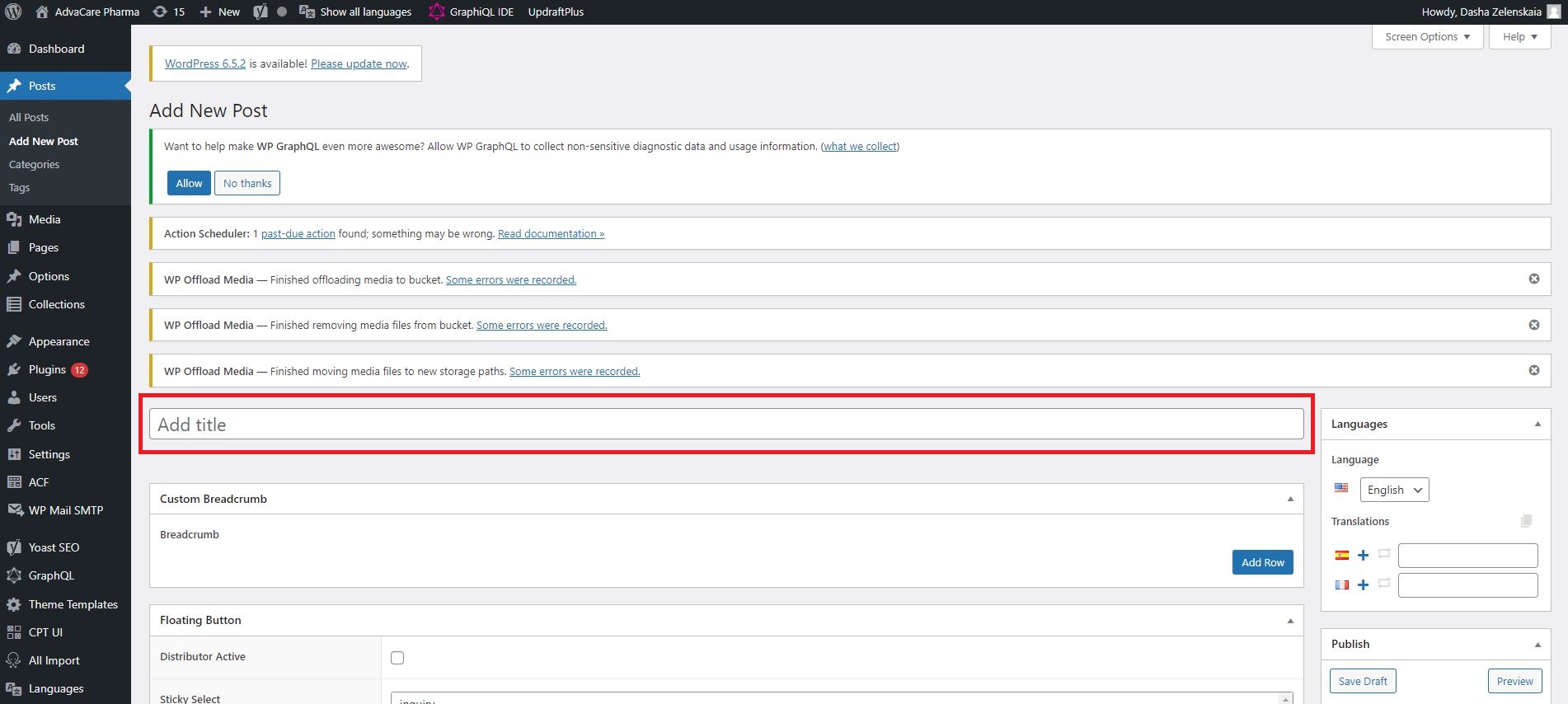
In both cases, the new post page will be opened with no information filled out.
Before adding the information, Content Editor must open another Article page in WordPress on another screen or another tab, to make sure to follow an existing Article reference.
Once the new post page is opened, Content Editor can start filling out the mandatory fields.
Mandatory Fields
-
Add Title - the main field on the page, the title H1 of the page. The title will be displayed on the page as Article Title, and the URL will be based on this title.
-
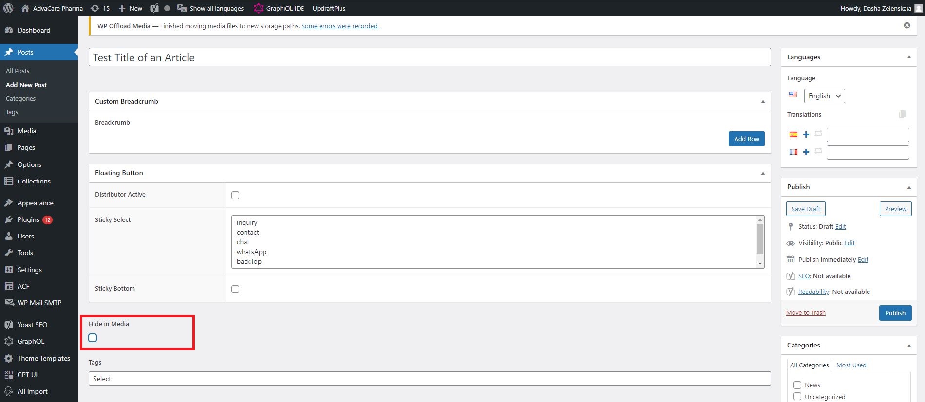
Hide in Media - field that allows to hide the Article from being displayed on the Media page. This checkbox needs to be filled for Landing Pages (any Articles that are created solely for the purpose of collecting google traffic and are not used for Campaigns, for example "Top 10 Pharmaceutical manufacturers in India"), etc.). For Website Media Posts related to Campaigns the checkbox should remain blank.
-
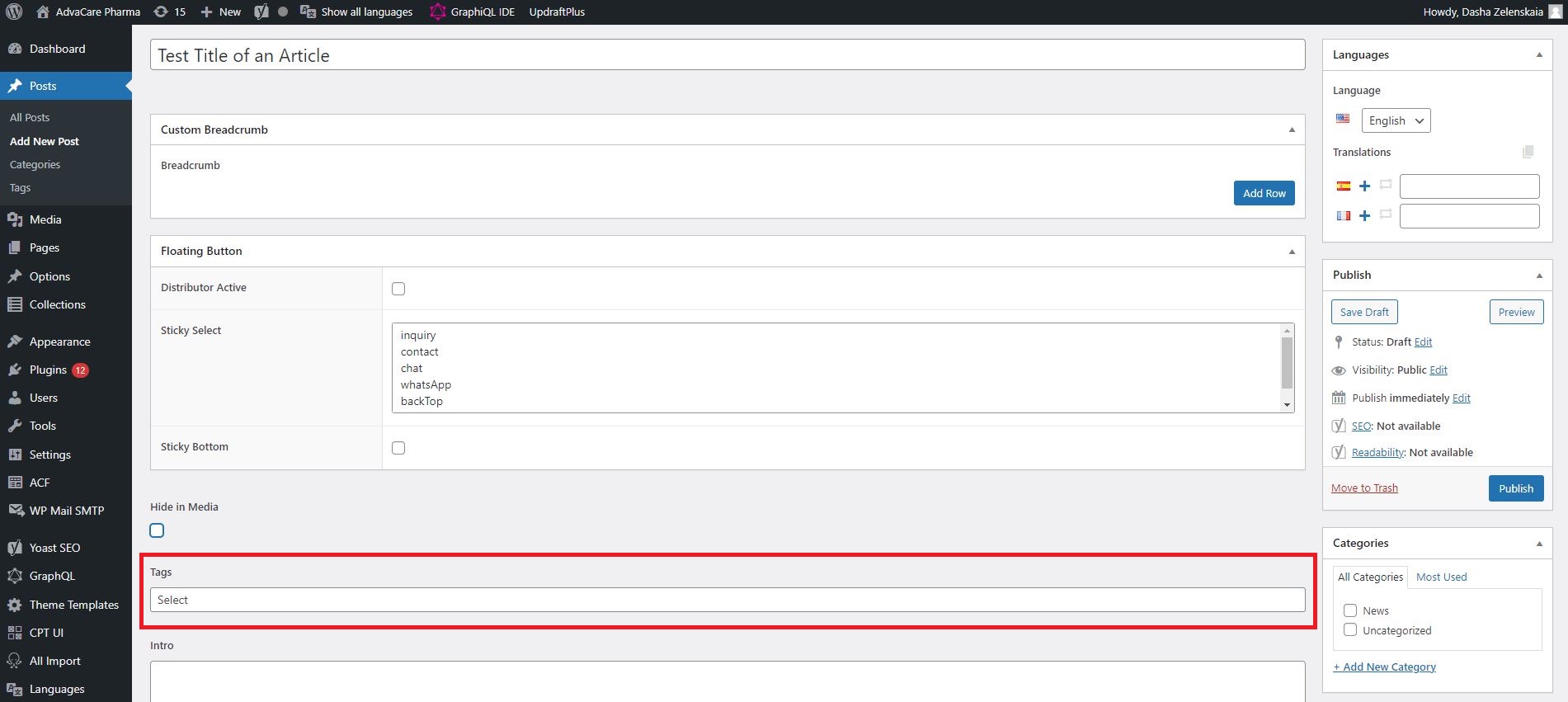
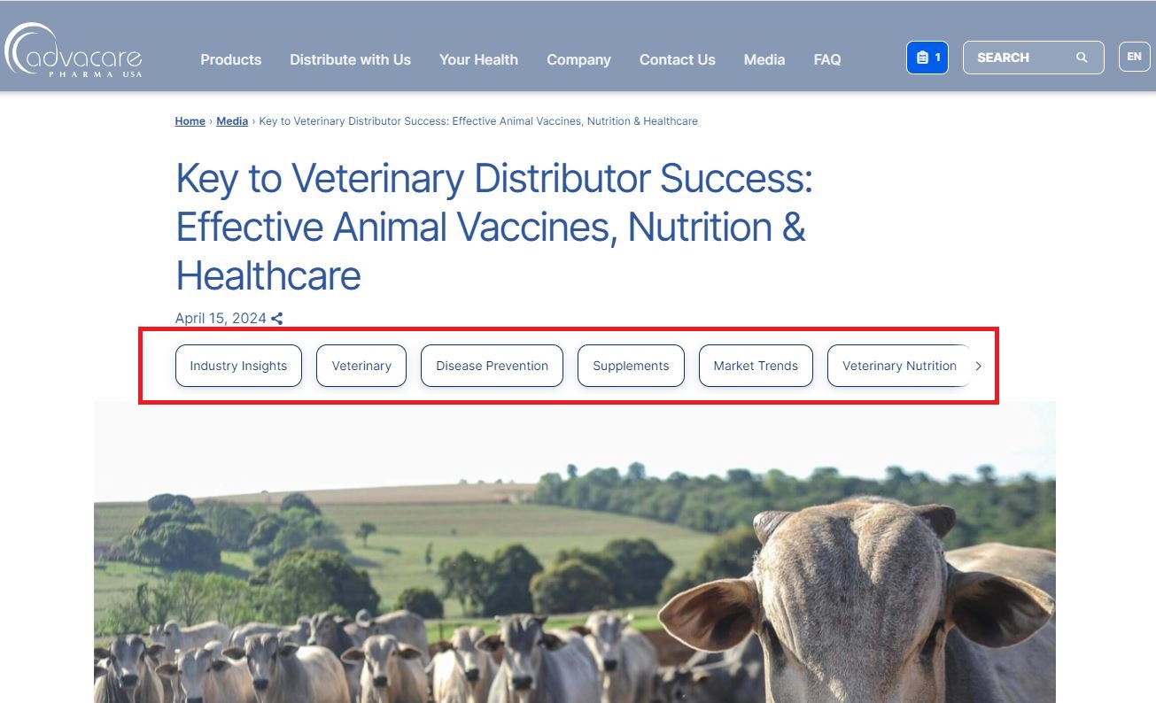
Tags - the sub-categories which the Article belongs to, filters under which the Article should be displayed in Media page. The first Tag is the main tag, and will be displayed inside the Article card on Media page.
In WordPress:
On the Article page:
-
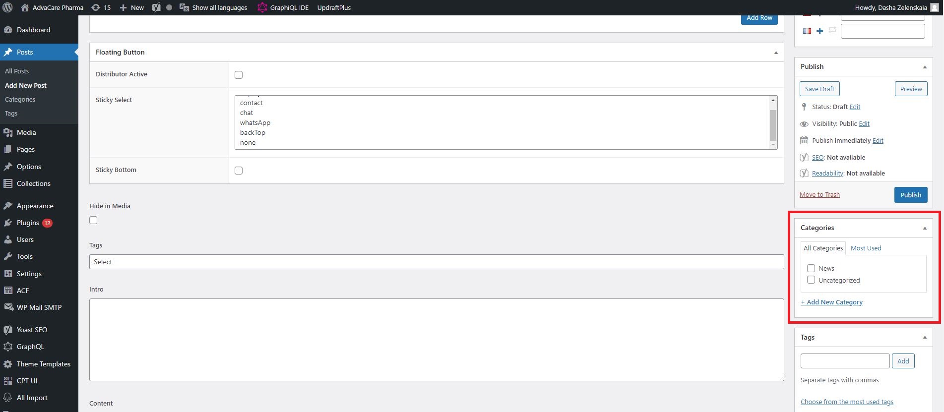
Categories - field that is used to separate pages in WordPress into Categories. These Categories are for internal use to make it easier to navigate across different types of Articles. If the Article is for Campaigns and to be displayed in Media page, select "News" category. If the Article is one of the Landing Pages, select the relevant category out of several Landing Pages categories available.
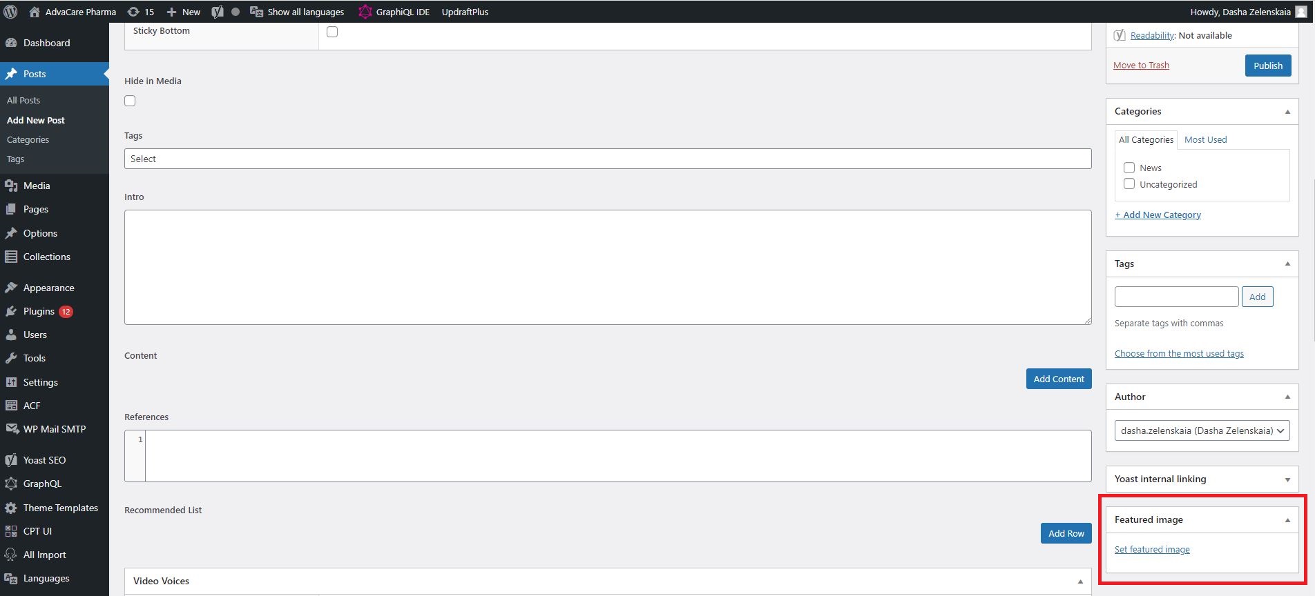
-
Featured Image - the field used to set the banner image on the Article. To set the banner image, click "Set featured image", choose "Upload files" in the Featured image popup, wait for the image to get uploaded. Set Alt Text for the newly added image, and click "Set featured image" to add it into the page.
Note: Alt Text must be added to every image uploaded on the website.
-
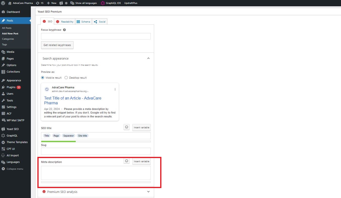
Meta Description - the field used to set Meta Description, which is a short paragraph of text that summarizes the content of the Article. This paragraph of text is used by Search Engines to understand the content of a page better. This field is located at the very bottom of the page in WordPress, in "Yoast SEO Premium" section.
-
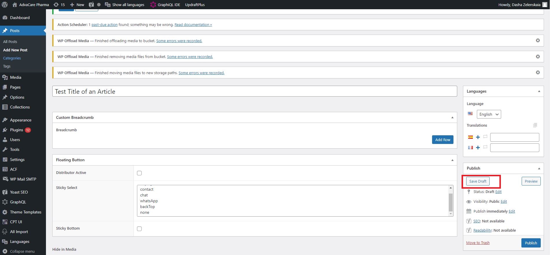
URL
Once all the above fields are filled out, click "Save Draft". This button will save all the changes made as draft, and generate the URL for the future page. Once URL is generated, it is mandatory to edit it to add "/news/" into the Article URL.
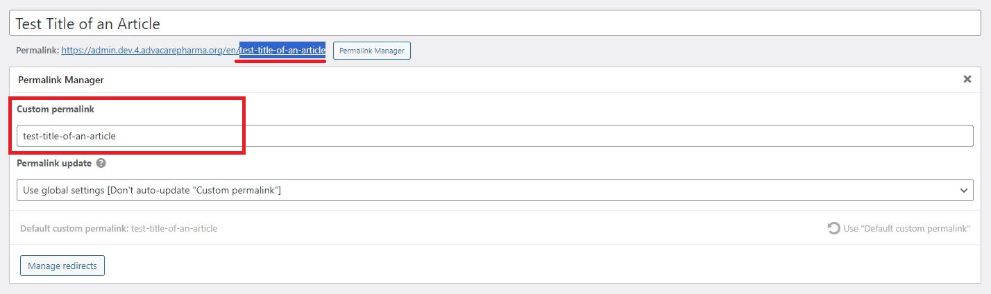
Once the draft is saved, click "Permalink Manager" under the page title next to the URL to edit the URL.
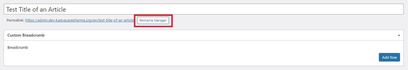
Copy the last part of already generated URL and past it inside the Permalink Manager into "Custom permalink" field:
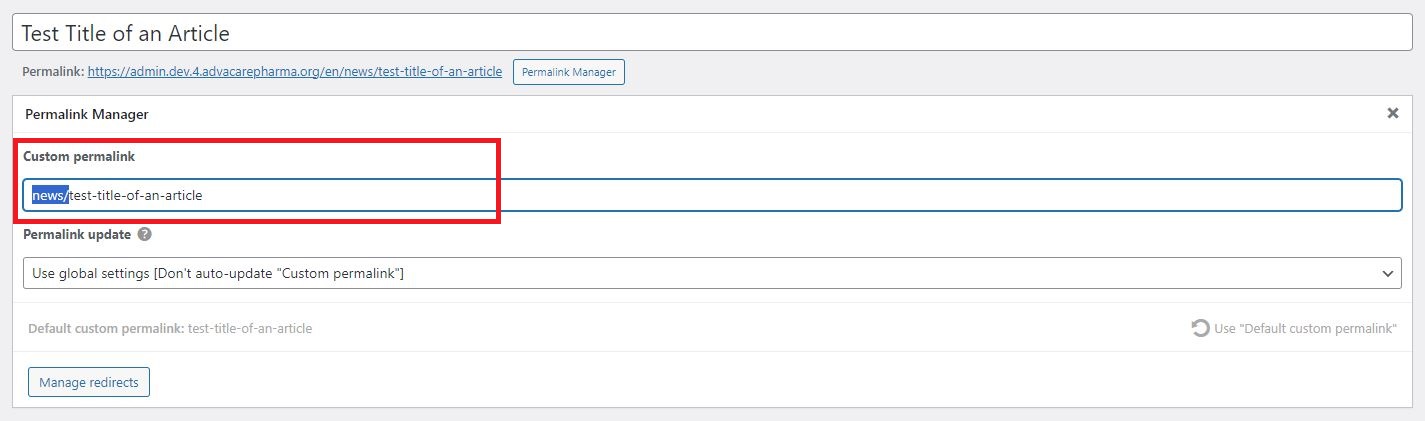
Once copied, edit the URL in "Custom permalink" field to add "news/" part of the URL:
Make other changes in the slug of the URL if the URL has been set by Marketing Dept.
MAKE SURE the final URL is 100% correct, follows the right format and does not contain any extra symbols:
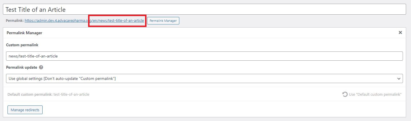
Once the URL is edited and checked, click Save Draft to save the changes in the URL.
Note: URL is the most important part of the page. URLs of published pages have to be 100% correct and NEVER contain any mistakes. If URL has to be changed AFTER the page is published in production then a redirect must be set for each URL that is being changed.
Adding Content Sections
After all the mandatory fields have been filled out, URL has been adjusted to the final one, and Draft has been saved, Content Editor can move forward with filling other fields and adding all the content to the new Article page.
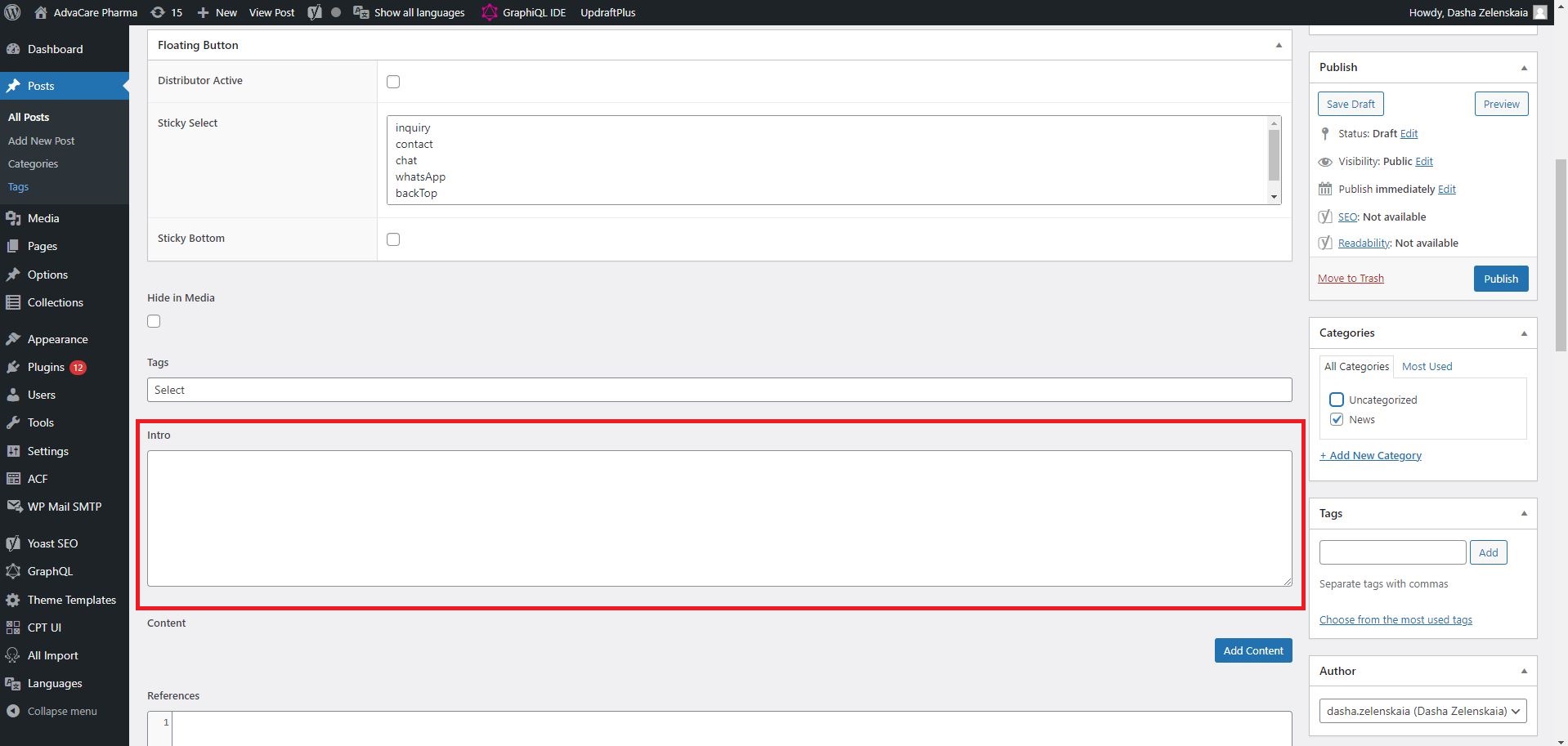
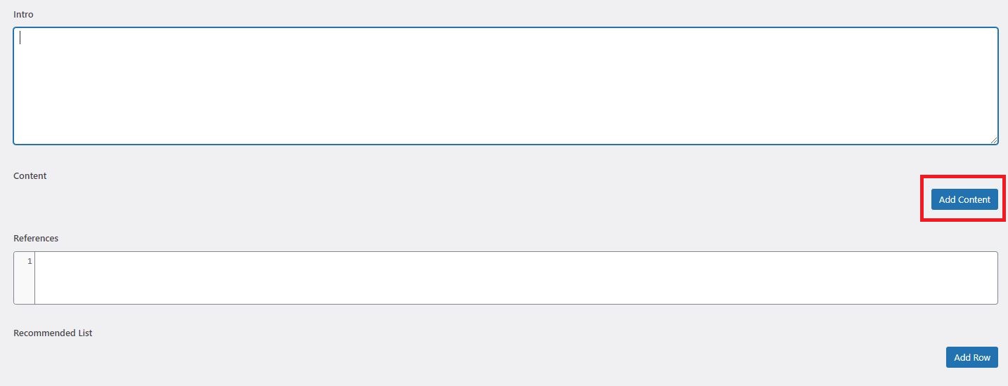
- Fill out "Intro" field - displays the text under the banner in larger and bold font than the rest of the content. Fill out this field if the Article is required to have an Intro, or leave blank if it’s not.
- Click "Add Content" button to add a content section.
- In the added Content section, select the relevant section type in Type dropdown. All the available Types are described in "Section Types" part of the SOP.
- Click "Add Paragraph" button to add
h3 subtitles and actual paragraphs of text, in those section types where it’s available.
- Fill out the content in the fields "Title (
h2)", "SubTitle (H3)", "Paragraph". Adjust the rest of the fields according to the selected type as required. Add HTML tags if required and make sure HTML tags are used properly with no errors.
Note: every image added to any section must contain Alt Text.
- Use "Add Content" button to add as many sections as required. Once all the sections are added, click "Save Draft" button.
Finalizing a new Article Page in DEV
Finalizing a new Article page is a multi-step process because it involves publishing the Article in English in DEV environment, checking and revising the published article, and receiving confirmation from the Final Approver.
Detailed steps of this process are listed below.
- Once all the content has been added to relevant sections in WordPress in DEV environment, click "Publish" button. Once the button is clicked, it will take some time for the website to update. Generally it might take 5-10 minutes for the website to reflect the changes.
Note: in case it takes longer for the website to reflect changes, click "Update" inside the relevant post in WordPress.
- When the website is updated, check the published article carefully to see if there are any broken sections or if content is not being displayed as desired.
- If any revisions are required, go back into WordPress editor, make the changes in the relevant sections, and click "Update" button. Wait for the website to reflect the changes.
Note: in case it takes longer than ~5 minutes for the website to reflect changes, click "Update" again.
- Check the updated article. Repeat points 2-4 as many times as necessary.
- Send a task to Final Approver(s) with the link to the article in DEV environment and request approval.
- If any revisions are requested, repeat points 2-5 until the final confirmation is received.
Once the Article in English is final and confirmed in DEV, Content Editor can move forward to create the page in Spanish and French.
Creating a new Article Page in Spanish/French in DEV
Once the page in English has been finalized, Content Editor must publish the article in Spanish/French in DEV.
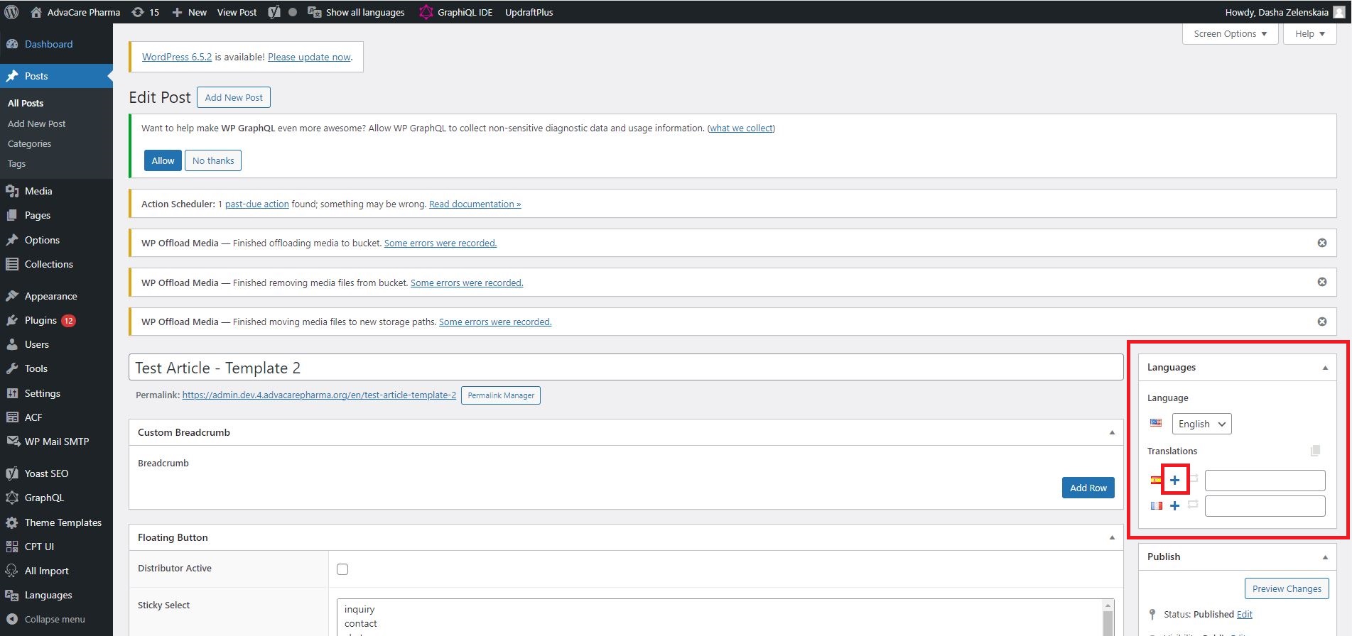
- To create the Spanish version of the Article, click on the "plus" icon next to the Spanish flag in "Languages" section on the right side of the screen in WordPress.
- A new post page will be created, with all the content filled out in English, except the Tags field which will replace English tags with Spanish tags automatically.
- Go through all the Mandatory Fields on the Spanish page and replace English content with Spanish where applicable. Mandatory Fields are:
-
Title: replace English title with Spanish translation;
-
Hide in Media: double check the field to make sure it is filled out if required to hide the new Post from Media page;
-
Tags: make sure all Tags are filled correctly in Spanish;
-
Categories: set a relevant category if applicable;
-
Featured Image: set the image with Spanish filename and Spanish Alt tag. By default English file will be used in this field;
-
Meta Description: replace English content with Spanish;
-
URL: edit the URL to add "/noticias/" the same way as it was done for English page.
- Replace English content in all sections with the Spanish content, and update any internal links URLs to their Spanish equivalents.
- Replace English images in all sections with the images with Spanish filenames and alt tags.
- Double check all the sections in WordPress to make sure there is no content in English left. Once reviewed, click "Publish". Generally it might take 5-10 minutes for the website to reflect the changes.
Note: in case it takes longer for the website to reflect changes, click "Update" inside the relevant post in WordPress.
- When the website is updated, check the published article carefully to see if there are any broken sections or if content is not being displayed as desired. Make sure all content is displayed in Spanish.
- If any revisions are required, go back into WordPress editor, make the changes in the relevant sections, and click "Update" button. Wait for the website to reflect the changes.
Note: in case it takes longer than ~5 minutes for the website to reflect changes, click "Update" again.
- Check the updated article. Repeat points 7-8 as many times as necessary.
- Once Spanish page is completed, return into WordPress and click on the "plus" icon next to the French flag in "Languages" section on the right side of the screen in WordPress to create French page.
- Repeat the process described in points 1-9 to publish the French page.
- Once all 3 pages have been completed, double check the connection of all 3 languages in the Languages dropdown in top right corner:
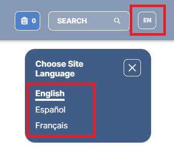
All 3 languages must be available from any of 3 versions. If any of the versions do not display all 3 languages, then the relevant page needs to be updated in WordPress one more time ("Update" button must be clicked).
- In case the new article needs to be added as one of the 3 featured articles in "Featured Content" section of Media page:
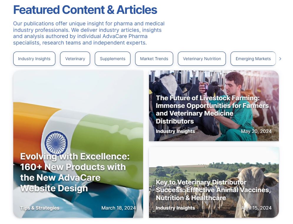
- 13.1 Open Media page in WordPress.
- 13.2 Navigate to the "Featured List" section and replace the old article with the new article by typing the name of the new article and selecting it in the dropdown.
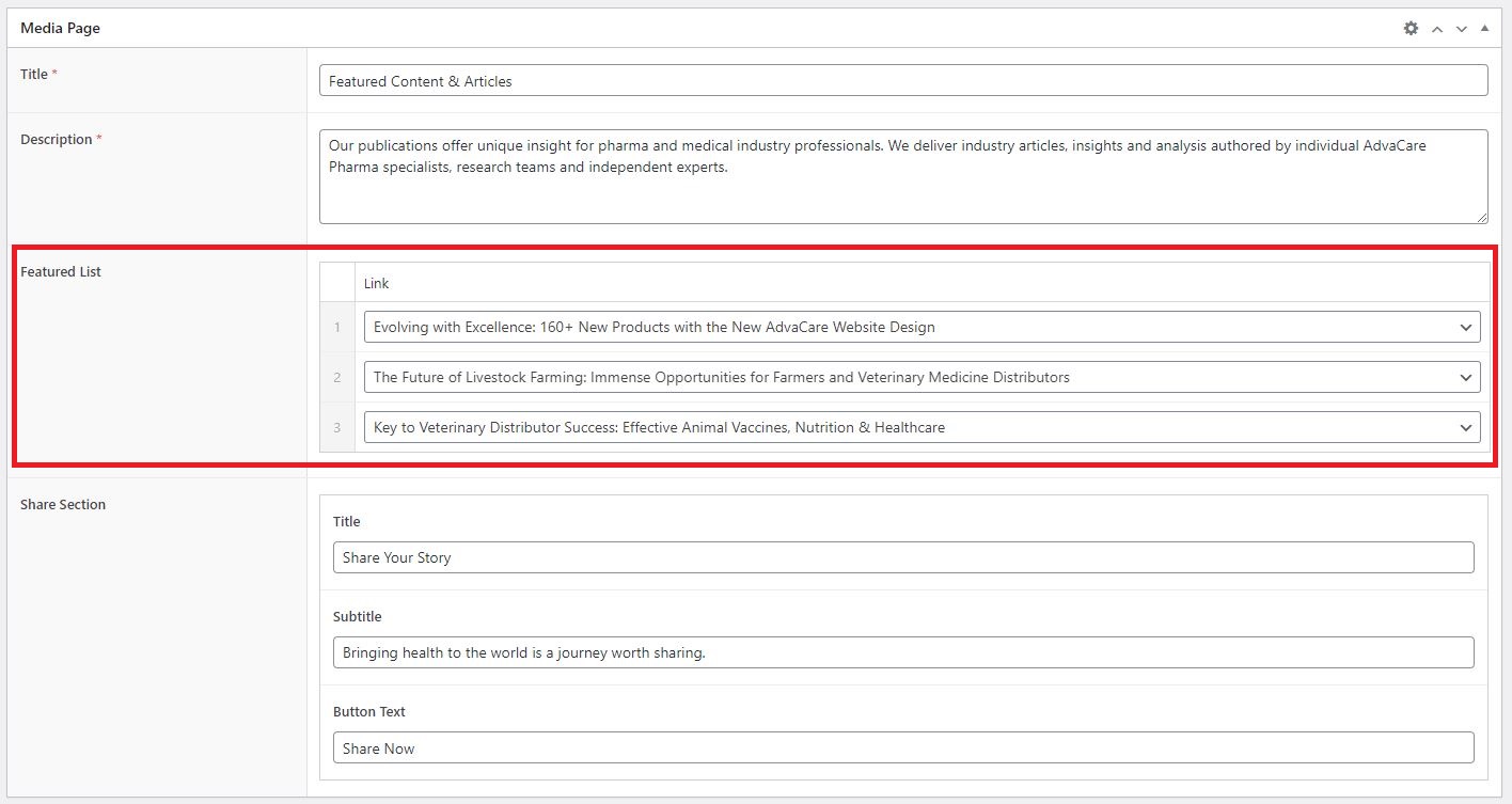
- 13.3 Click "Update" to save the changes.
- 13.4 Repeat the process for each language.
- Send a task to Final Approver(s) with the links to the article in Spanish and French in DEV environment and request approval.
- If any revisions are requested, make the revisions until the final confirmation is received.
Publishing Final Pages in Production
Once pages in all 3 languages have been confirmed in DEV environment, Content Editor can move forward to publish them in the Production environment.
- Navigate to "Posts" in WordPress in Production environment, and create a new Article page.
- Open the same page in DEV environment on another screen.
- Go through each field/section and copy/paste or replicate the fields and information exactly as it is in DEV environment.
- Double check the Mandatory Fields and make sure that everything is filled out correctly.
- "Save Draft" to save changes of the first language. Do NOT publish the newly created post at this point.
- Create the other 2 languages versions by clicking on "+" icon in Languages section. Repeat the steps to copy/paste or replicate all the fields as per relevant page in DEV environment.
- "Save Draft" for each language version.
- Double check the post in every language before moving forward with publishing.
- Once all 3 languages are completed, click "Publish" in each language version one by one in quick succession.
- Wait for the website to reflect the changes. Double check the published pages to make sure that all 3 languages are published and connected correctly (each version must display all 3 versions in Languages dropdown).
Note: in case it takes longer than ~5 minutes for the website to reflect changes, click "Update" again.
- Send a task message to Final Approver(s) with the links to the article in all 3 languages in Production environment and request approval.
- If any revisions are requested, revise the pages until the final confirmation is received.
|


